Is it a good time to fly? Now you’ll know. We just launched a new feature that helps you find delay patterns before you even head to the airport. It shows you the typical delay for each hour of the day, then compares it to what’s actually happening right now versus the last two weeks. It’s a game-changer for choosing the best flight times, and completely free!
How to use the feature
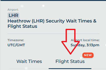
Head to airport page, say Heathrow Airport.
Tap the “Flight Status” tab:
Scroll down until you see this graph:
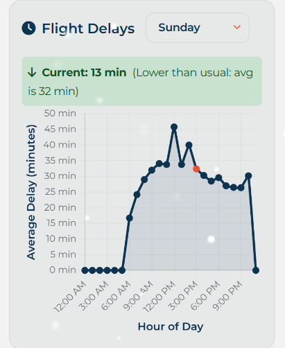
The X axis represents the hour of day (airport local time), the Y axis, the average delay in minutes. The graph defaults to the current weekday. Simply use the weekday dropdown to select a different day. This is helpful, if you want to check typical flight delays on the day your flight departs.
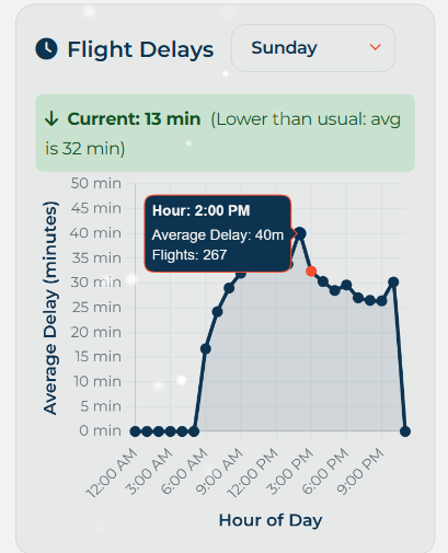
The orange point represents the current hour. If you tap any of the points, it will bring up the average delay, and the number of flights used to calculate said delay. In this example, across 267 flights at 2pm on Sunday at Heathrow Airport, the average delay is 40 minutes.
To help contexutalise the data, there is a comparison of the current delay, versus what it has been on average. In the example above, the current delay at 2pm at Heathrow is lower (13 minutes) than it typically is (32 minutes).
Please note, this feature is only available for the following airports: Heathrow, Gatwick, Birmingham, Stansted, Manchester, CDG, JFK, OHare, Madrid, Barcelona and Munich. However, we’re working on supporting more airports soon!
This blog post was written by a human.
One thought on “NEW: Airport Flight Delay Trends”